
%20(Blog%20Banner).png?width=2240&name=LANDING%20PAGES%20(300%20%C3%97%20175%20px)%20(Blog%20Banner).png "Building A Successful Landing Page")
Whatever your goal is, a well-designed, functional landing page can help you achieve success. The focus of a landing page is to guide your reader towards a specific goal. While a web page might inform a reader about all your products or services, a landing page is designed using specific messaging to drive the desired outcome.
So, how do you ensure your landing page hits the mark? Well, this simple checklist is the place to start.
1. Create a compelling headline that is focused on the benefit.
Seven out of ten people who land on your page are likely to bounce off, and studies show you have less than 15 seconds to convince a visitor to stay on the page. Communicating the benefit of yours immediately at once to the visitor can increase the likelihood they’ll stick around.
For example: “Free eBook: Generate More Leads from Your Blogs”
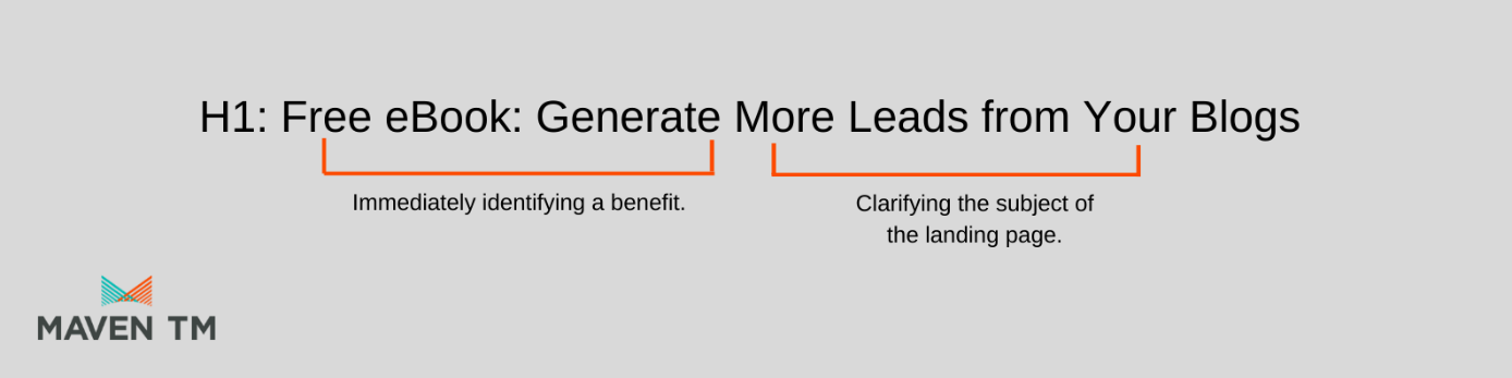
Getting your headline right increases your chances of turning your visitors into engaged leads. Clearly communicate through a header why engaging with this landing page will offer the visitor value and spark their interest in this value.
2. Sub-header communicating the problem your solution solves, or benefits.
A sub-header is a short, to-the-point text that clearly convinces the visitor that this solution can solve their problems. This is your opportunity to give extra information about what it is your landing page has to offer.For example: “Download our guide to help turn more of your blog readers into SQL’s”
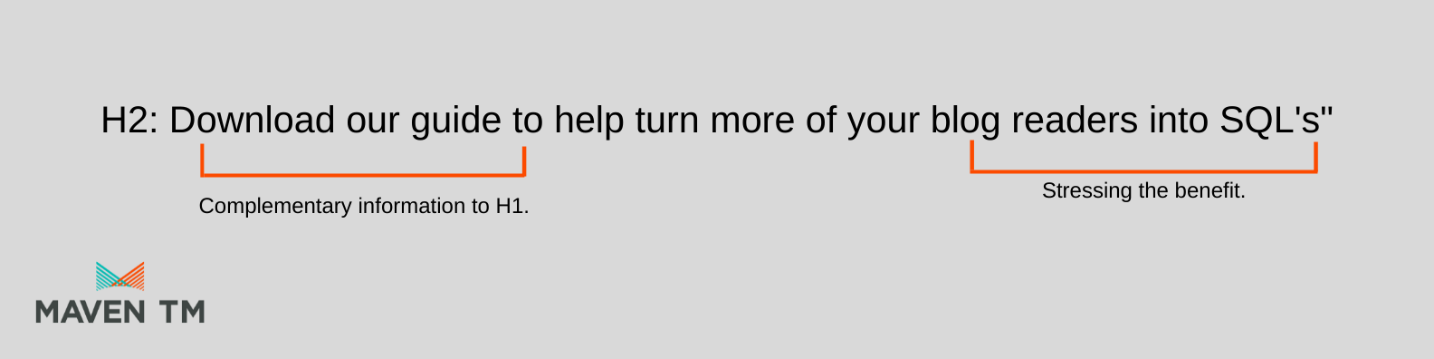
An effective subheading:
- Supply complementary information to the heading.
- Stresses the benefits of the offering, in this case, we are offering a guide for our target persona to download in regard to generating more leads through blogs. Generating leads is a benefit, convey that.
- A good subheading encourages action.
Keep the copy concise, and uncomplicated. Make sure the copy guides the reader to the desired call to action. Every word written must contribute to the campaign goal.
Including a compelling statistic or guarantee within the copy helps sell the offering. For example, “Our method increases conversion rates by 40%”. This is a convincing figure that clearly communicates the benefit of using this method.
Simple tips for a compelling copy:
- Use basic language and simple sentence structure.
- Write as a human, not as a robot. Keep your copy conversational.
- Do not use overused marketing buzzwords such as “once-in-a-lifetime", or “exceeding customers' expectations”.
- Use action words to lead your reader to a call to action. All your copy should focus on getting that conversion.
The most essential element is a call to action. Does the colour stand out, is it clear to the visitor exactly what will happen when they click it? The CTA must be large enough to be noticed for the reader to know it exists.
Good examples are “Sign Up and Save”, “Talk to Us”, “Click for a Free Trial”, “Book A Demo” etc.
A quick list for an effective CTA:
- Copy makes the reader want to act and use concise and action words.
- A clear value proposition that clearly communicates what happens when you click the button.
- The colour theory: utilising complementary colours that sit opposite each other on the colour wheel. Each colour has emotion attached to it, so think about how these colours associate with the call to action.
- Relevant to the landing page; have a clear understanding of where your visitors to your page are sitting on your sales cycle. A blog created for new visitors should be targeted with a landing page call to action relevant to the information they need.
Smart design, style and colours make a landing page pleasing to the eyes.
A relevant image that illustrates to the visitor what is on offer. It adds colours and depth to the landing page, while also communicating a product or service. Think about how the image should make the target audience feel.
5. A form that is above the fold.A lead form needs to be readily accessible, so the visitor does not have to scroll to find it. Make sure your page is responsive to both mobile and digital views and keep the form above the fold on both devices.
Only ask for the information that you need to help remove barriers. If you do not intend to send email content, do not ask for email addresses. Visitors may not be inclined to withhold information they believe to be unnecessary.
To conclude, most pages will have a similar, yet successful structure:
- Headline & Subheading
- Relevant Image
- Lead Form
- CTA
- Compelling Copy
But remember one conversion goal to one landing page. Keep the page simple and make sure the message gets across with no distractions.
Focus on your landing page goal first, and then start writing your copy. Make sure the goal and the copy align. Next, start working on your header and subheader. Write down at least 10 ideas and work from there on the best one for your campaign. Next, present your best call-to-action on the landing page making sure it drives the desired action. Finally, create the design and colours of the landing and choose relevant imaging that compliments your brand and the offering. Imaging is a fantastic opportunity to make the landing page visually pleasing.
Maven TM uses this tried and tested method to create landing pages. By getting to understand what your audience is looking we can build landing pages for our clients that help achieve campaign goals.

.png?width=400&height=100&name=Maven%20TM%20White%20Logo%20Image%20(1).png "Maven TM White Logo Image (1)")

